How do I use the heat map?
Do you want to be able to glance at a map and instantly glean insights about the people who live there? Then it's time to use our heat mapping tool.
This article will walk you through how to use the heat mapping tool.

The heat mapping functionality is available for all users. However, for users with Essential or Advanced membership plans, more granular Zoom Levels are unlocked so you can explore your region at the community, or even neighborhood levels.
Use Case: Imagine you want to plant a church in Vancouver that offers services mainly geared towards people aged 20 - 34.
1. Under the Research tab, above the Area Map, type 'Vancouver' in the Location search bar.
2. Now, change the Zoom Level on the left panel to 'Community (ADA)'. This will help you to categorize Vancouver into some smaller regions to start our evaluation of where to plant a church.

If the left panel is not showing, simply click on this icon  in the top left hand corner to reveal it.
4. In the subsequent drop-down menus that appear below the Heat Map menu, select 'Age Statistics' and finally, '20-34'. You will see the heat map take effect on the map of Vancouver.
5. Now we can see how this age group is dispersed throughout Vancouver and where they are most densely populated (The darker the color, the higher the number of people). We can move the map over the darkest area and then change the Area Zoom Level again to dive into that specific region to explore that region at a neighborhood level.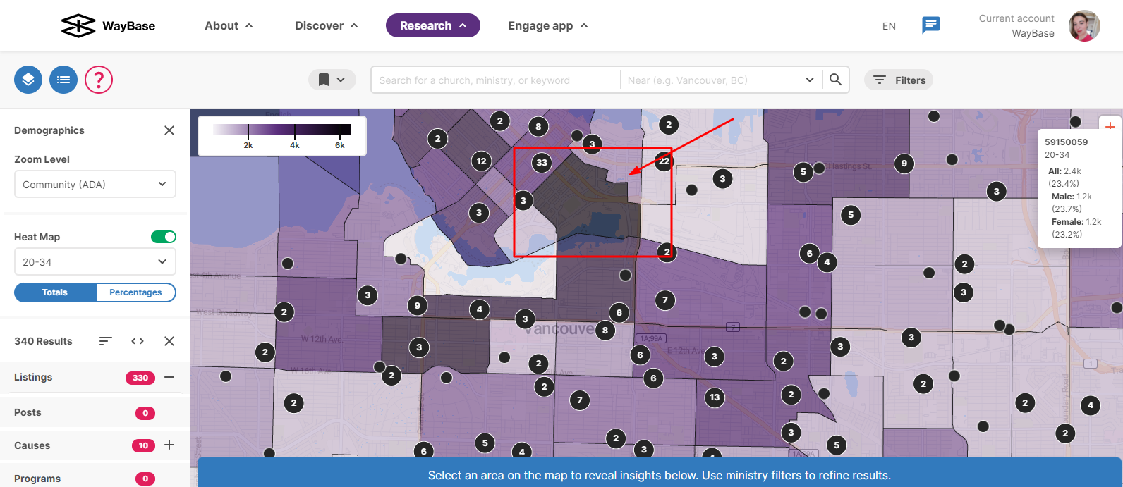
This tool will give you a much better idea of where you could strategically plant your church. You can use the heat map tool to discover other demographics as well, like language, household structure, and more.
Related Articles
How do I explore my neighborhood?
In this article, we are going to walkthrough how to use the Map to better understand your neighborhood. Only accounts with an advanced subscription have access to these features. Upgrade your account here. 1. Click on the Research tab in the top ...How do I download graphs & charts from the Research section?
You may want to use some of the graphs and charts that are generated under the Research Tab for your newsletter, board report, or presentation. In this article, we will walk you through how to download the graphs and charts as image files. The graphs ...The Act Tab
Engage is all about channeling what you’re learning into practical action. In other words, letting all your knowing serve all of your loving. Acting on Engage is beneficial for many reasons: you can track your growth over time, ensure you’re growing ...How can I save my search and get notifications on my search criteria?
Setting up notifications will enable email alerts daily or once a week with any updates that are relevant to you. This will save you from repeatedly checking the platform to see if there are new causes, posts, or listings in either a category or ...How do I set up my multi-site church?
This article helps central administrators of multi-site churches set up their accounts and listings on WayBase. Login to WayBase with your organization account. In the Discover tab, search for the parent listing for your church in the search bar. ...